April 24, 2026
Conversion focused web design is making a website to get people to act.
Here is a quick list of what it does:
Your website should work for you. Most sites look good but do not sell. 98% of people leave without doing anything. This is a design problem.
The good news? You can fix it. You do not need to start over. You just need to make it easy for people to buy.
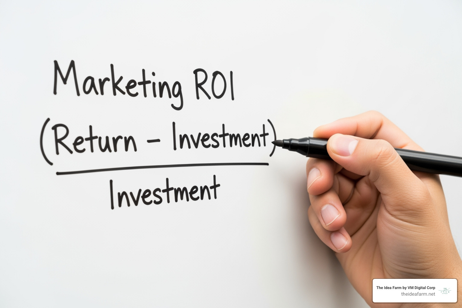
I am Jose Escalera. I run The Idea Farm by VM Digital. I have built companies and worked in sales. I use conversion focused web design to turn visitors into leads. I will show you how to do it.

Easy Conversion focused web design glossary:
Conversion focused web design is about focus. Many sites try to do too much. They have too many links. This makes people confused. When people have too many choices, they choose nothing.
The attention ratio is a big idea in design. It is the number of things a person can do versus the one thing you want them to do. If there are 40 links but only one "Buy" button, the ratio is 40:1.
We want a 1:1 ratio. This means there is only one choice. This stops people from getting stuck.

If your ad says "Cheap SEO" but your site says "Digital Growth," people will leave. Your site must match your ad.
Use the same colors and fonts too. This makes people feel safe. This is part of Conversion Rate Optimization. It makes the trip from the ad to the sale feel smooth.
The button is the most important part. It turns a visitor into a lead.
To make a good CTA:
People do not read every word. They scan. Studies show that people scan in an F-shape. They look at the top and the left side.
To win at conversion focused web design, put your best info where people look.
Design is about how the brain works. We use simple tricks to help people trust you.
The Fogg Model says people act when they have three things:
If one is missing, they will not buy.
People do what others do. This is the bandwagon effect.
You can use:
For an Ecommerce developer Houston, adding stars to products helps a lot.
You can point people to your button without words.
Images are fast. The brain sees them much faster than words. Your design tells a story before the visitor reads a word.
The big photo at the top is the "hero."
Friction is anything that makes it hard to buy. If your site is slow, people leave.
Most people use phones. Your site must work well on a small screen. This is mobile optimization.
Speed is key. If a site is slow, people quit. Google checks your speed with Core Web Vitals. If your site is slow, you will rank lower.
No one likes long forms.
Conversion Optimization Consulting can help you find these problems. A small change can lead to more money.
Design is a process. You must test and learn. What works for one site might not work for another.
This is when you test two versions of a page. You see which one wins. You might test:

Heatmaps show where people click. If they click the wrong spot, you can fix it. A Houston web developer uses this to make your site better.
The best ratio is 1:1. This means there is only one thing to do. This keeps people focused. On a home page, the ratio will be higher. But for ads, 1:1 is best.
People on phones are in a hurry. If your site is hard to use, they will leave. Good phone design makes it easy to buy with one thumb.
Speed builds trust. A slow site feels broken. Most people want a site to load in 3 seconds. If it is slow, they will go to a different site.
A good website does more than look pretty. It uses conversion focused web design to help people. It guides them to a solution for their problems.
At The Idea Farm, we help you grow. We build systems that work for you. We use data to make smart choices.
Are you ready to grow? Stop working so hard for every lead. Visit https://theideafarm.net/ to see how we can help you.