June 17, 2026
Building reports and dashboards is a very important skill for business leaders in 2026. Many teams have too much data but do not know what it means.
Here is a quick guide to help you understand:
| Question | Quick Answer |
|---|---|
| What is a report? | A detailed list of data that answers a specific question |
| What is a dashboard? | A simple, one-page view of key numbers to help you make quick choices |
| Which tools are most popular? | Power BI, Salesforce, ServiceNow, Smartsheet, Google Data Studio, Bricks |
| Do you need coding skills? | No. Many new tools use AI and simple drag-and-drop screens |
| How often does data refresh? | It can be real-time or on a schedule (from every 10 minutes to 48 times a day) |
| What is the biggest mistake? | Showing too much data without a clear goal |
The main problem is not a lack of data. It is a lack of clear meaning. Reports pile up. Dashboards get built and then ignored. People ask for numbers and get spreadsheets they cannot read.
In the construction industry, nearly 60% of project problems come from bad management. Also, 16% come from poor communication. This happens in every industry. When leaders cannot see what is happening, things go wrong.
The right tools change this. They turn raw numbers into clear choices.
I am Jose Escalera, CEO of The Idea Farm by VM Digital. I have built and grown many companies. Building reports and dashboards has always helped me turn business confusion into real growth. I am using my experience to help you compare these tools.

Basic building reports and dashboards terms:
To build systems that grow, you must know the difference between a report and a dashboard. They are not the same. They do different jobs.
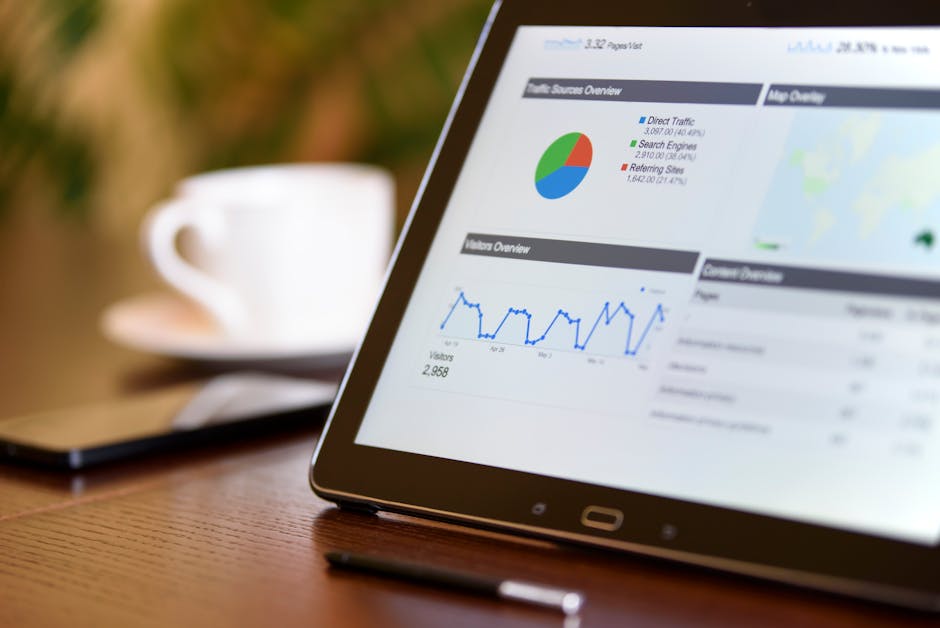
A report is a detailed look at specific facts. It answers a clear question. For example, a report can show you all clients who have not had a meeting in the last ninety days. It usually looks like a table. It can have many pages. It comes from one set of data.
A dashboard is a one-page view of your business. It is a tool to share information. It uses pictures like bar charts, pie charts, and number cards to show how things are going. In tools like Salesforce or Power BI, every dashboard picture is fed by a report. You cannot have a dashboard without reports.

Workers use reports to do their daily tasks. Bosses use dashboards to make big plans. If you need to know which sales worker is behind on calls today, look at a report. If you need to know if the company is making enough money this year, look at a dashboard.
To learn how these tools help keep clients happy, read our guide on building a Customer Success Dashboard.
These tools are useful because of how you can use them. Modern tools make old spreadsheets look very outdated.
First, they are interactive. In a new report, clicking a bar on a chart will change the other charts on the page. This lets you see how different numbers connect.
Second, you can drill down. This means you can click a chart to see the exact numbers behind it. If a dashboard shows a sudden rise in spending, you can double-click it. The system will show you the exact bills that caused the rise.
Third, they update in real time. This keeps everyone on the same page. Some systems connect directly to your data. They update every time a sale is made. Other tools update on a schedule. For example, Power BI Pro updates eight times a day. Power BI Premium can update forty-eight times a day.
Lastly, you can set up automatic emails. You can have reports sent to your team every Monday morning. In Salesforce, you must save reports in public folders for these emails to work.
To learn how to set up these automatic systems, check out our guide on Building Custom Dashboards & Reports - SPARK Business Works
Choosing the right tool depends on the software you already use and your business goals. Different tools handle and clean data in their own ways.
The table below compares the top tools for building reports and dashboards in 2026.
| Platform | Best For | Data Refresh Rate | AI Capabilities | Visual Customization |
|---|---|---|---|---|
| Power BI | Deep business analysis and Microsoft users | Scheduled (up to 48x/day) or live connection | Copilot for automatic reports and summaries | High (custom styles and themes) |
| Salesforce | Customer relationships and sales tracking | Real-time when you load the report | Einstein AI insights | Medium (standard charts) |
| ServiceNow | IT tasks and service management | Real-time work data | Smart predictions | Medium (work charts) |
| Smartsheet | Project management and team work | Auto-refreshes every 10 minutes | AI-guided charts | Medium (custom colors and simple charts) |
| Google Cloud | Marketing data and web stats | Changes based on connection | Chat-based BigQuery tools | High (easy drag-and-drop and custom themes) |
Big business tools are made for large teams, safety, and deep data work. They need clean data and clear rules about who can see what.
Power BI is the best tool for deep data work. It cleans raw data before showing it in charts. You can connect Power BI to databases, spreadsheets, or cloud services. It is great at handling complex data.
To see how we use Power BI for marketing, read our guide on a Marketing Dashboard Power BI.
Salesforce uses report types to choose which data you can analyze. When building dashboards in Salesforce, you must think about the "running user." This is a safety setting. It decides what data a viewer can see.
A static dashboard shows data based on one specific person's access. A dynamic dashboard changes based on who is logged in. This ensures that workers only see the files they are allowed to see.
To learn how to set this up, read our guide on building a Customer Success Dashboard Salesforce.
ServiceNow stores work data like IT problems and changes.
When building reports in ServiceNow, it is best to copy the standard templates. This keeps future software updates from breaking your work. You can group problems by team or priority to find bottlenecks. If a manager sees too many open problems, they can click the chart to assign tasks to new people right away.
In safety and building inspection fields, tools like BuildingReports provide clean data. You can learn more about how these reports work by visiting The Most Trusted Name in Compliance Reporting - BuildingReports or browsing their resources at Newsroom Archives - Page 2 of 8 - BuildingReports.
For teams that need speed and teamwork instead of heavy data cleaning, collaborative tools are a great fit.
Smartsheet works like a mix of a spreadsheet and a database. It is great for teamwork. Smartsheet dashboards bring together important data from many sheets and reports.
You can use custom colors to match your brand. You can save up to thirty-nine colors per dashboard. Shared dashboards update on their own every ten minutes. This keeps everyone on the same page without extra work.
Google Cloud offers Data Studio, which is now part of Looker. It connects to more than 1,400 data sources. This includes Google Sheets, Google Ads, and BigQuery. It has an easy drag-and-drop editor. This makes it simple to design beautiful reports.
Data Studio is free for basic users. It has a paid Pro version for big projects. You can see what it can do at Data Studio: Business Insights Visualizations | Google Cloud.
If you want to build custom dashboards without coding, tools like Fabricate and Bricks use AI to help. With the Analytics Dashboard Builder | Build Data Dashboards with AI | Fabricate, you can connect your data and build layouts by just typing what you want.
Also, the Dashboard Builder & Maker: AI Dashboard Tool | Bricks lets you upload a simple CSV or Excel file. The AI reads your data, picks the best charts, and makes a full dashboard in sixty seconds.
For more tips on choosing these tools, read our guide on how to Build Custom Dashboards.
A dashboard that nobody uses is a waste of time. To make sure people use it, you must design it to be clear, simple, and easy to read.

Always put your most important numbers in the top-left corner. This is where people look first. Group similar numbers together. Use the same colors for the same things on every page.
Do not use too many colors. Too many bright colors make it hard to see what is important.
For more design tips, look at our guide on creating Custom Analytics Dashboards.
When building reports for deep study, give users ways to sort the data themselves.
Group your data into simple categories. For example, instead of listing every client's age, group them into age ranges.
Make sure money, percentages, and dates show up correctly. This makes the data easy to read.
Use simple filters. A smart filter lets users sort by region, then state, then city, all in one menu.
Only load the data you actually need for your charts. Loading extra data slows down your reports and annoys users.
To see how these features help your business grow, read our Growth Dashboard Complete Guide.
Bosses do not have time to look through long lists of numbers. They need to see how the business is doing in five seconds.
Use big number cards to show key facts, like monthly sales. Always pair these numbers with simple arrows. A green up-arrow shows if things are getting better.
Keep it clean. Do not crowd too many charts onto one screen. If you have more than eight charts, put them on different pages.
Use bar charts to compare items. Use line charts to show trends over time. Use gauge charts to track goals. Use pie charts only when you have a few things to compare.
For examples of clean layouts, read our guide on building a Dashboard for SaaS.
Building reports and dashboards is also changing special fields like construction and building.
Global construction spending will reach $14 trillion by 2025. But construction projects often run late and cost too much.
To fix this, modern companies are linking 3D building models with tools like Power BI. This lets project managers connect 3D models directly to live schedules and budgets.
This works very well. Using these 3D models has cut down project disputes by up to 90% in some cases.
Instead of copying data into spreadsheets, managers can load 3D data directly into a Power BI dashboard. This lets people click on a wall in a 3D model and instantly see its cost, when it will be built, and if it is on schedule.
You can read the full research paper on this topic at A Customized Business Intelligence Dashboard Utilizing Building Information Modeling for Better Control and Management of Construction Projects.
This change is happening locally too. In Houston, Texas, city departments use public dashboards to track building inspections. You can view them at Dashboard Reports - City of Houston.
Local businesses use structured data for property checks, like the services from Houston Inspection Services | National Property Inspections®.
In Danville, Kentucky, local officials use directories to manage building inspections. You can see this at Staff Directory • Building Inspection - Boyle County, KY.
AI is changing how we build and read business data. It makes the process faster and easier for everyone.
In Power BI, Copilot lets you make full report pages by just typing what you want. You can ask the AI to read your data and write a short summary. This saves you from writing summaries by hand.
Smartsheet uses AI to help you build charts. You can describe what you want to track, select your sheets, and the AI will build the charts for you.
Tools like the Reporting Dashboard: AI Reporting Tool | Bricks go even further. Bricks writes a written analysis next to your charts. When you upload your data, the AI explains what the numbers mean and flags items that need quick attention.
For construction teams, using a Construction Dashboard: Track Projects | Bricks lets you track budgets, safety, and changes. The AI then writes a status report that you can share with owners right away.
A report is a detailed, multi-page document made from one set of data. It shows long lists of facts, often in tables, and lets you study the details.
A dashboard is a single-page view that shows key numbers from many reports. Reports are made for detailed daily work, while dashboards are made for quick, big decisions.
Update times depend on the tool you use and your plan. Smartsheet dashboards update on their own every ten minutes.
Power BI reports can update eight times a day with a Pro plan, forty-eight times a day with a Premium plan, or in real time.
Salesforce dashboards update in real time whenever you open or refresh the page.
Yes. Modern tools use simple drag-and-drop screens that do not require coding.
AI tools let you upload a spreadsheet and make a professional dashboard in seconds. You can change these dashboards by typing simple sentences.
Building reports and dashboards is not just about making pretty charts. It is about building a system that tells you the truth about your business so you can make smart choices.
At The Idea Farm, we help businesses grow. We do not just look at simple numbers. We build connected marketing and growth systems made for your specific goals.
If you are ready to stop guessing and start growing with clear data, let us build your custom system. See how we track the numbers that matter by reading about The Growth Dashboard.