June 19, 2026
Developing dashboards in Excel does not have to be hard. Here is the quick way to do it:
How to develop a dashboard in Excel (quick steps):
Imagine it is Monday morning. You get three emails asking for the same sales data. Each email wants a different format. You open a huge sheet with 80,000 rows. You start to copy and paste numbers. This takes a long time.
Many business leaders do this. They have the data, but they cannot see the main points.
More than 750 million people use Microsoft Excel. Yet, most still make reports by hand. This wastes time and leads to mistakes. When leaders do not trust the numbers, they make slow decisions.
You do not need an expensive tool. You just need a good Excel dashboard. It must have clean data and clear charts.
My name is Jose Escalera. I am the CEO of The Idea Farm by VM Digital. I help business leaders turn raw numbers into clear steps for growth. I will show you how to build your own dashboard.

Many teams use complex web apps or special tools to make reports. These tools cost a lot of money. They are also hard to learn and take a long time to set up.
For growing businesses, developing dashboards in Excel is the best choice. Most computers already have Excel. Your team does not need to learn a new tool to read your reports.
Excel dashboards help you make choices faster. Businesses that use them make decisions 30% to 50% faster. Leaders can filter the data themselves. They do not have to wait for an analyst.
If you work with data, you might think you need to write complex code. But you can actually Forget Streamlit: Create an Interactive Data Science Dashboard in Excel in Minutes. Excel lets you build great tools without writing any code.
At The Idea Farm, we help businesses grow. Before you buy expensive software, you should get your basic reports right. Learning how to start building a dashboard in Excel is the fastest way to see how your marketing and sales are doing.
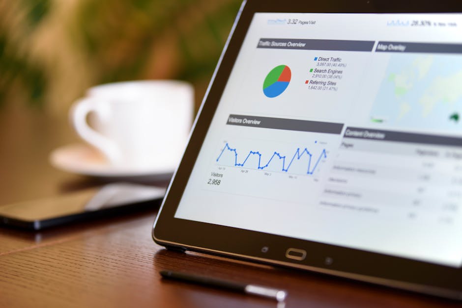
To build a dashboard that does not break, you must follow a simple plan. We use three separate sheets: the Data sheet, the Calculation sheet, and the Dashboard sheet. Keeping these three parts separate makes your file stable.

A good dashboard needs clean data. Bad data causes most dashboard errors. Before you make charts, you must clean your raw data.
Your data must be in a flat table. This means:
Once your data is clean, click any cell in your data. Press Ctrl+T to turn it into an Excel Table. Give your table a simple name like tblSales.
You must use Excel Tables. When you add new rows later, the table grows on its own. Your charts and formulas will update automatically.
To learn how to set up your data, read How to Create Dashboards in Excel: The 2026 Expert Guide. If you want to track key numbers, you can also learn how to build KPI dashboard Excel to keep your team on track.
The Calculation sheet is where you do the math. This sheet sits between your raw data and your dashboard. It does the hard work so your dashboard stays fast.
You can do this in two ways:
PivotTables are the fastest way to sum up large data. Click inside your table, go to Insert > PivotTable, and put it on a new sheet called CalcEngine.
Use a new PivotTable for each chart. Give your PivotTables clear names. This makes it easy to connect filters later.
If you want to design your own layout, you can use formulas. Use SUMIFS, COUNTIFS, and AVERAGEIFS to add up your data.
To learn this method, read this guide on how to build a dynamic Excel dashboard without Pivot Table. This way works on all versions of Excel and is easy to check.
No matter which way you choose, keep your math on a separate sheet. To do more, you can learn how to build custom dashboards that use both formulas and PivotTables.
Now, let us build the visual sheet. Create a new sheet and name it Dashboard. This is the only sheet your team needs to see.
First, hide the gridlines. Go to View and uncheck Gridlines. This makes your sheet look like a real app instead of a basic spreadsheet.
Next, add your visual parts:
=, and click the cell on your CalcEngine sheet. This links the shape to your data.After adding Slicers, right-click them and choose Report Connections. Check the boxes for all your PivotTables. Now, when you click a button, all charts will update at once.

To see how these parts work together, read Building an Interactive Dashboard in Excel (2026): From Raw Rows to a Decision-Ready View - TheLinuxCode.
To make your dashboard easy to read, follow these simple rules:
Here is a simple comparison of Excel versus other tools like Power BI:
| Feature | Excel Dashboards | Power BI and Other Tools |
|---|---|---|
| Data Limit | Best under 100,000 rows | Can hold millions of rows |
| Cost | Free with Microsoft 365 | Costs extra money each month |
| Learning Curve | Low (most people know Excel) | High (you must learn new tools) |
| Sharing | Share by email or OneDrive | Share on a special cloud site |
| Updates | Click refresh to update | Updates on its own |
If you run a subscription business, you can use these rules to build a dashboard for SaaS. This helps you track monthly sales and keep customers.
You can also combine these layouts with customer success analytics. This helps your support team see which customers might leave.
To keep your dashboard accurate, use Power Query to bring in your data. Power Query cleans your data for you. You do not have to clean it by hand every time.
Just paste the new data into your file. Then open Excel and click Data > Refresh All. Excel will clean the data, update your tables, and refresh your charts.
The easiest way to share is to upload your file to OneDrive or SharePoint. You can use Microsoft Groups. Follow the steps in this guide to Create and share a Dashboard with Excel and Microsoft Groups - Microsoft Support.
To stop people from breaking your formulas, lock your Dashboard sheet. You can also share it as a read-only file. This lets people use the filters but keeps your formulas safe.
Excel is a great tool, but it has limits. If you have more than 100,000 rows of data, Excel can get very slow. It also cannot easily connect to many live tools at the same time.
If your business is very large, you may need a bigger tool. To see when you should switch, read our growth dashboard complete guide.
Making dashboards in Excel is a fast and cheap way to see your business numbers. Keep your raw data, your math, and your charts on separate sheets. This makes your tool easy to use and update.
But a dashboard is only good if you track the right things. Knowing how to make a chart is just the start. You must know which numbers help your business grow.
At The Idea Farm, we help businesses grow. We work from our offices in Houston, Texas, and Danville, Kentucky. We help companies build marketing systems that turn numbers into growth. We do not just make reports. We help you plan your strategy.
If you want to stop copying and pasting and start growing your business, let us talk. See how we can build a custom system for you by visiting The Growth Dashboard.