
May 27, 2026
If you want to build a KPI dashboard in Excel, follow these steps:
Most leaders have data in too many places. It is hard to see the truth. A good Excel dashboard fixes this. It puts your main numbers on one screen. You can read it in less than a minute.
Many dashboards are built too fast. They break easily. The data gets old. This guide will help you build it the right way.
I am Jose Escalera. I help businesses grow. I have seen how the right numbers help people make fast choices. This guide will help you build a KPI dashboard in Excel that your team will love.
A KPI dashboard is one screen with your most important numbers. It is not a long report. It is a tool to help you make choices.
A good KPI has three parts:
For example:
Numbers alone do not tell the whole story. A dashboard shows if you are doing well or if you need to change something. Most teams should track 5 to 20 KPIs. Too many numbers will confuse you.
Every KPI is a metric, but not every metric is a KPI. A KPI is tied to a big goal. It has an owner and a plan. If the number is bad, someone must take action.
Excel is still very popular. It is easy to use. Most people already have it on their computer. It is cheap and fast. You can make a great dashboard without buying new software.
A dashboard helps when it shows you what to do next. It becomes noise when it tracks too many things. Good dashboards make patterns easy to see. Bad dashboards make meetings longer.
Before you make a chart, think about who will look at it. This is the most important step. If you need help with this, read More info about custom dashboards.
Ask these questions:
Leaders want to see big goals like total profit. Managers want to see how the team is doing. Workers want to see their daily tasks.
Here are some examples:
Every KPI should be useful. It should have a clear goal and a person in charge of it.
Now let us build it.
Use these four tabs:
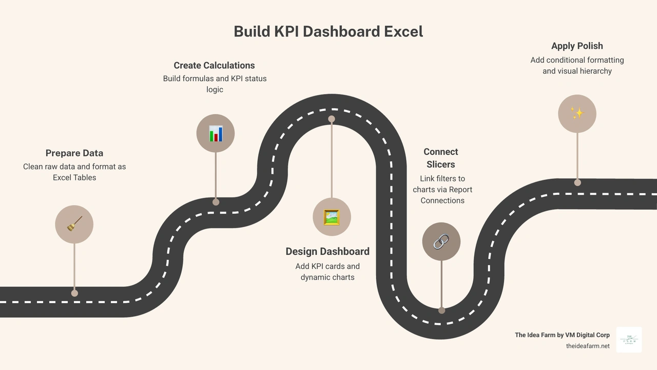
In the Data tab, keep things simple. Put one record in each row. Do not mix math with your raw data. Turn your data into a Table by pressing Ctrl+T. Give it a name like "SalesTable".
Your Math tab is the engine. Use simple formulas like SUMIFS to add up totals. Use XLOOKUP to find your goals.
Use simple rules for colors:
Make a PivotTable from your data. This helps you group numbers by month or region. Add slicers so you can filter your charts. You can connect one slicer to many charts. This makes the dashboard interactive.
Now make the visuals. Use line charts to show trends over time. Use bar charts to compare different groups. For a great guide on this, see How To Build Dynamic KPI Dashboards in Excel.
Put your most important number in the top-left corner. That is where people look first.
A dashboard should be easy to read. Excel can make things look messy if you are not careful. Use big numbers for the main facts. Use colors to guide the eye.
A KPI tile should show the name, the number, and the change from last month. Use colors like red and green to show status. You can learn more from How to build a beautiful KPI dashboard.
For more ideas on layout, see More info about custom analytics dashboards.
Excel is great, but it is not perfect. Sometimes it can be hard to manage.

Formulas can break. People might use the wrong version of the file. It can be slow if you have too much data. To fix this, protect your cells and keep a backup of your file.
You can find templates to help you start. Here are a few:
When you use a template, make sure to change the goals to fit your business.
Yes. You can use basic tables and charts. You do not need fancy tools to make a good dashboard.
Try to have 5 to 10. If you have too many, it is hard to focus. Put extra numbers on a different page.
Update it when you need to make a choice. Some teams do it every week. Others do it once a month. The most important thing is to look at it and take action.
A KPI dashboard helps you lead your team. It is more than just a spreadsheet. It is a way to make better choices.
To succeed, pick good goals. Build a clean file. Make it easy to read. Most of all, use the numbers to take action. A dashboard that no one looks at is not helpful.
At The Idea Farm, we help teams grow. We want you to make fast choices that help your business. If you want to learn more, read our Growth Dashboard Complete Guide and look at The Growth Dashboard. We are here to help you build a system that works.