June 26, 2026
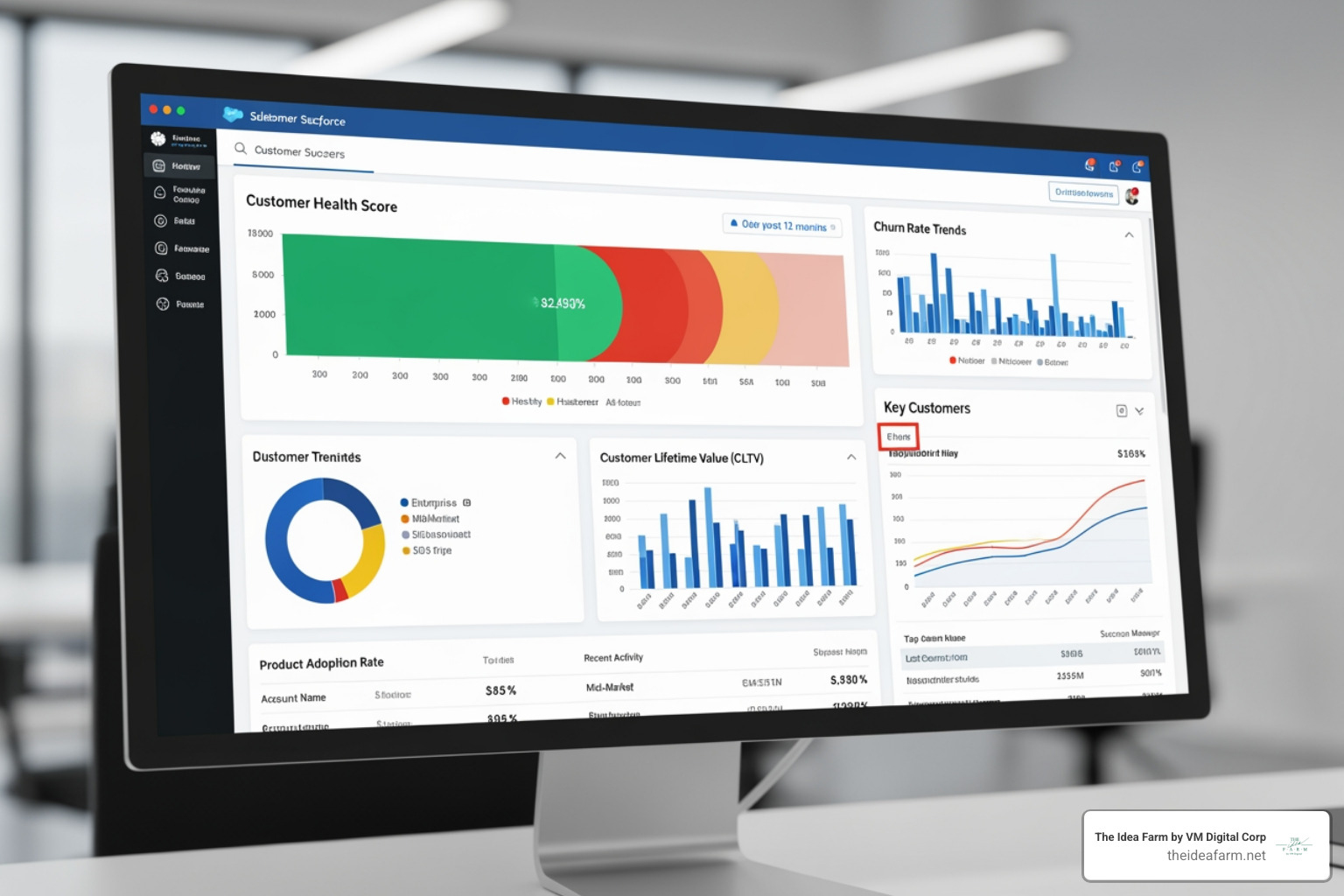
A data analytics dashboard is a screen that shows your most important business numbers in one place. It updates in real time. This helps you make fast, smart decisions without looking through messy spreadsheets.
Here is what you need to know right away:
Here is the big problem.
Your numbers are all over the place. Sales numbers are in one spot. Ad costs are in another. Revenue is in an email. None of these tools talk to each other.
When you need to make a choice, you have to guess. Or you spend hours putting numbers together. That takes too long.
This is called data overload. It wastes your money and stops your business from growing.
A good dashboard does not just organize your numbers. It helps you act fast.
I am Jose Escalera, CEO of The Idea Farm by VM Digital. I help business owners build simple systems to track their growth. I build data analytics dashboard setups that people actually use. In this guide, I will show you how to stop drowning in numbers and start making smart choices.

Data analytics dashboard basics:
A data analytics dashboard is a tool that shows your key business numbers. It takes hard data from different places and turns it into simple charts.
Many people confuse dashboards with reports. They are not the same. A report is a flat document. It shows what happened in the past. It is usually a PDF or a spreadsheet. By the time you read it, the numbers are old.
A dashboard is alive. It connects to your data and updates on its own. You can click on a chart to filter the numbers. You can change the dates. You can hover over a line to see the exact number.
A report is like a photo of your business. It shows one moment. A dashboard is like a live video. It shows what is happening right now.
This helps you make better choices. With old reports, you look backward. When you use custom analytics dashboards, you look ahead. You can spot problems early. You can find new ways to grow.
Good dashboards are easy to read. They do not just dump numbers on a screen. They put the most important numbers at the top left. They use colors like green and red to show if a number is good or bad. You can understand your data in seconds.
Not all dashboards are the same. You must build the right dashboard for the right person. A boss needs a different view than a tech worker.

There are three main types of dashboards.
| Dashboard Type | Primary Audience | Update Frequency | Main Purpose |
|---|---|---|---|
| Operational | Frontline Teams | Real-time or Hourly | Monitor daily activities and spot immediate blockages |
| Strategic | Executives & Owners | Weekly or Monthly | Track long-term goals and overall business health |
| Tactical | Managers & Leads | Daily or Weekly | Track department performance and allocate resources |
Operational dashboards are for workers on the ground. They show what is happening right now.
Teams use them to do their daily jobs. For example, a support team needs to see open customer questions. They need to see if they are answering fast enough.
These dashboards update constantly. They use simple bars and lists. They do not show old history. They just show if today's work is on track.
Strategic dashboards are for bosses and owners. They do not show daily clicks. They show the big picture.
A strategic dashboard tracks long-term goals. It shows if the business is healthy. You can see total sales and costs over the last few months.
These dashboards do not need to update every minute. Once a week or once a month is fine. The design is very clean. It uses simple lines to show if you are meeting your goals.
Tactical dashboards are for managers. They sit in the middle.
A manager needs to see how their team is doing this week. A marketing manager wants to see which ads work best. A sales manager wants to see how many deals are close to finishing.
These dashboards help managers make plans. They show which tactics work so they can spend money wisely. They update daily or weekly. They let you filter by product or area.
The biggest mistake is trying to track too many things when building a dashboard. If you make fifty charts, your screen will be a mess. No one will use it.
To build a great dashboard, start with your main goal. This is your single most important number. Then, pick a few smaller numbers that help you reach that goal.
You need two types of numbers:
Tracking both helps you see where you are going. This is the secret to a good growth dashboard complete guide or a customer success dashboard.
Keep your dashboard simple. Only show 5 to 15 key numbers.
Your brain cannot look at too many things at once. Too many charts will confuse your team. They will stop using the tool.
Put your most important number at the top left in big text. Put other numbers below or to the right. If you need to track more than 15 numbers, do not crowd the screen. Make a second page instead. Keep each page focused on one topic.
Building a dashboard is not as hard as it looks. You can do it in a few simple steps.
First, know who will use it. Write down three to five questions the dashboard must answer. If you do not do this, you will build something no one wants.
Second, check your numbers. Make sure they are correct. If your data is messy, your dashboard will show wrong facts.
Third, pick your tools. You can use Data Studio: Business Insights Visualizations | Google Cloud for free. For deeper work, look at open-source tools like getredash/redash or Dashboards and reporting from Metabase. Over 90,000 companies use Metabase. If you want to use AI, tools like Dashboard | Mammoth Analytics can build charts for you.
Fourth, draw your layout. Sketch your design on paper first. This helps you focus on how it looks. Follow best practices for building reports and dashboards by keeping it clean.
Finally, build and test. Connect your data and make your charts. Show it to a few people first. Get their feedback and fix any issues. Then, share it with the whole team. You can also read our guide on how to build custom dashboards for more tips.
To make your dashboard work, you must connect it to your data. Modern tools can connect to databases and other software.
If you have tech workers, they can build Dataverses Dashboard - SQL-Powered Interactive Dashboards using SQL. This lets you write queries to pull the exact data you need. Users can also filter by date.

Make sure your data updates at the right speed. If you track ads, once a day is fine. If you track computer servers, you need real-time updates.
Building a dashboard is only half the job. The hard part is getting your team to use it. Many companies build nice dashboards, but people stop using them after a few weeks.
One big problem is trust. If a manager sees a wrong number, they will stop trusting the dashboard. They will go back to their old spreadsheets. To stop this, clean your data first. Make sure everyone agrees on how to count each number.
Another problem is when teams do not agree. Marketing might count a lead when someone fills out a form. Sales might only count a lead after a phone call. If they use different definitions, it will cause confusion. You must make sure everyone uses the same words.
If you are near our offices in Danville, Kentucky, or Houston, Texas, you know how important clear systems are. For example, businesses looking at Data Analytics Jobs in Houston, TX (NOW HIRING) - ZipRecruiter or Data Analytics Jobs, Employment in Danville, KY | Indeed need simple dashboards. When you hire a new worker, a clear dashboard makes training much faster.
Schools and public services need clear data too. In Danville, the Danville Schools School Report Card data shows growth in areas ... shows how visual data helps the community track progress. Also, researchers at the Research Analytics - IRADS - University of Kentucky use data systems to manage big projects. Whether you run a school or a store, clean data is the foundation of success.
A dashboard is a live screen that updates on its own. It is made for quick checks and fast choices. A report is a flat document that shows one moment in time. Reports are better when you need to write a long story about why numbers changed.
It depends on who is looking at it. Daily workers need real-time updates. Managers need daily or weekly updates. Bosses only need weekly or monthly updates. Setting the right speed keeps your dashboard fast.
Yes, you can. If you are new, you can learn about developing dashboards in Excel or how to build kpi dashboard excel. But spreadsheets take a lot of manual work and can break. As you grow, you should use automated tools to save time and avoid mistakes.
Stop letting too much data slow you down. Guessing costs money, and manual reports take too much time. A clear data analytics dashboard gives your team the facts they need to make fast choices.
At The Idea Farm, we do more than build charts. We are your growth partner. We build marketing systems that connect to your numbers and goals. We help you replace messy spreadsheets with simple, growing systems.
If you want clear facts about your marketing and growth, let's talk about building The Growth Dashboard for your business. Let's stop drowning in data and start growing with confidence.