
July 21, 2026
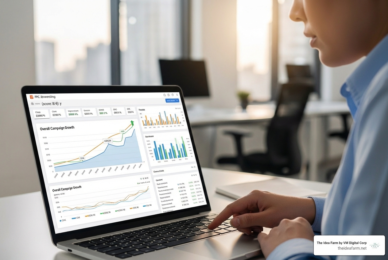
A customer analytics dashboard is a simple screen. It brings your customer data into one place. It helps your team make fast and smart choices.
Here is what it shows you:
Most businesses have too much data. They do not have clear answers.
Your CRM has one piece of the puzzle. Your support tool has another piece. Your website tool has a third piece. Someone has to paste them all into a spreadsheet before your Monday meeting.
That is a big problem. Split data slows you down. It also costs you money. Research shows companies can lose up to 8% of their sales when they give bad customer service. This happens because the warning signs were hidden in different tools.
Many people say companies do not listen to them. That is not a listening problem. It is a tool problem.
A good customer analytics dashboard fixes this. It gives everyone the same true facts. It updates in real time. It shows each person just what they need to see.
I am Jose Escalera, CEO of The Idea Farm by VM Digital. I help businesses build marketing systems that work. I design customer analytics dashboards that help you make choices. They do not just look pretty. In this guide, I will show you how to build one in an easy way.
Customer analytics dashboard glossary:
A customer analytics dashboard is an interactive, visual tool. It translates raw data from your sales, marketing, and support channels into clean, digestible charts. Unlike old-school reporting, it is not a dead PDF. It is a living, breathing command center.
When you use a modern dashboard, you can see how users move through your product or website as it happens. This helps you spot friction points. It lets you see where customers get stuck and why they leave.
By connecting your tools, you get a full view of the customer journey. You can read about this approach in our guide to customer success analytics. To understand how visual insights drive business decisions, you can also look at How a Customer Analytics Dashboard Drives Strategic Growth.
The core purpose of a customer analytics dashboard is simple: to drive action. It helps you stop guessing and start knowing.
Instead of debating what your customers want, you look at the data. You can see which features they use most. You can track their lifetime value. You can see if your support team is resolving issues quickly.
A good dashboard helps you answer critical questions:
Setting this up requires a clear plan. If you want to build one yourself, check out our step-by-step guide to building a dashboard.
Many teams still rely on static reports. These are weekly or monthly summaries sent via email. While they have their place, they suffer from high latency. By the time you read a monthly churn report, those customers are already gone.
Real-time dashboards update automatically. They give you the operational speed to act immediately. Here is how they compare:
Static Reports:
Real-Time Dashboards:
For a deeper dive into balancing these two approaches, read about the best practices for building reports and dashboards.
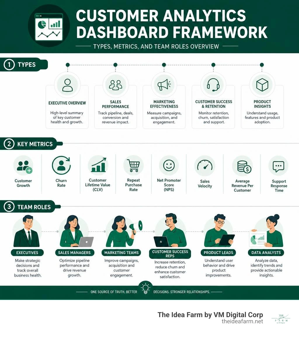
You do not need to build a single, massive dashboard that tries to do everything. In fact, that is a quick way to lose your sanity. Instead, we recommend building specialized dashboards focused on specific business goals.
By focusing each dashboard on a specific department or objective, you keep the data clean and actionable. This approach helps your team make faster decisions without getting overwhelmed by irrelevant metrics.

This dashboard is your early warning system. It tells you who is using your product and who is about to leave. It is especially critical for subscription and software businesses. To learn more about setting this up, check out our SaaS dashboard guide.
Key metrics to track:
This dashboard tracks the money. It helps sales leaders monitor pipeline health, win rates, and the speed of deals moving through the funnel. It also connects marketing spend to closed revenue. For more on this connection, read our marketing revenue attribution guide.
Key metrics to track:
This dashboard shows how people interact with your digital storefront or software application. It helps product and marketing teams optimize the user experience. You can see where users drop off and which pages keep their attention. For a complete strategy, view our growth dashboard guide.
Key metrics to track:
This dashboard aggregates feedback from your customer support and success teams. It shows you how happy your customers are with your service and product. Monitoring this helps you prevent negative experiences that lead to revenue loss. See our customer success dashboard guide for implementation tips.
Key metrics to track:
This dashboard focuses on your best customers. It tracks repeat purchases, referral rates, and engagement with your loyalty programs. It helps you identify advocates who can drive organic growth. To build a marketing strategy around this data, read our data-driven marketing guide.
Key metrics to track:
Building a customer analytics dashboard sounds easy. But when you connect databases, you run into real tech problems.
If you build a dashboard for your own customers to see, safety and speed are very important. Many teams use special tools to do this. You can see how this works with Upsolve AI - Customer-Facing Analytics as a Service. If you want to build your own custom setup, we have a guide on how to build custom dashboards to help you.

When your dashboard looks at millions of rows of data, it can get very slow. If a user clicks a button and has to wait ten seconds, they will stop using it.
This is called the "Postgres wall." Normal databases are made to handle one row at a time. They are not made to group millions of data points quickly.
To get fast speeds, you need special databases or a very smart setup. For a full guide on how to fix these speed problems, check out our custom analytics dashboards guide.
If you build a dashboard for customers, you must make sure Customer A can never see the data of Customer B. This is called tenant isolation.
Using simple database filters is not safe enough. A single code mistake could leak private data. True safety requires separate systems or strong database rules.
You can read more about how modern tools handle this in the Analytify Customer-Facing Analytics Platform guide.
A great dashboard is clean and easy to read. It should not look like a cockpit of a commercial airplane with hundreds of flashing lights. It should guide the user's eye to what matters most.
If you want to build visual systems that drive growth, you need to focus on clarity and structure. For a broader look at visual design standards, read our data analytics dashboard guide 2026.
It is easy to fill a dashboard with metrics that make you feel good but do not help you make decisions. We call these vanity metrics. Page views and total registered users are classic examples. They always go up, but they do not tell you if your business is healthy.
Instead, focus on actionable metrics. These are metrics that tell you exactly what to do next. For example, instead of tracking total signups, track the signup-to-active-user conversion rate. If that rate drops, you know you need to fix your onboarding flow.
To learn how to select the right metrics, check out our guide on how to measure marketing effectiveness.
Different people in your company need different data. An executive wants to see high-level revenue trends and customer lifetime value. A customer support rep needs to see open ticket volumes and CSAT scores for their specific accounts.
Do not try to force everyone into the same view. Build role-based dashboards. This keeps the interface clean and prevents team members from getting overwhelmed by irrelevant data.
If you use a CRM like Salesforce, you can set up role-based views easily. Learn more in our guide to building a salesforce customer success dashboard.
Operational analytics is all about speed and immediate action. It tracks live metrics like active users, support queue length, and server performance. It prioritizes real-time data over perfect consistency.
Strategic reporting is about long-term trends. It tracks metrics like quarterly revenue, annual retention, and market share. It prioritizes accurate, finalized data over speed.
Many teams start by building these reports in spreadsheets. If you are doing this, read our guide on developing dashboards in Excel to make the process smoother.
The return on investment of a dashboard comes from three main areas:
To calculate the exact financial impact of your marketing and data systems, read our marketing ROI calculation guide.
This is a classic software question. Building in-house gives you complete control, but it requires significant engineering resources and ongoing maintenance. Buying a platform gets you to market faster, but it comes with recurring licensing costs.
For most businesses, a hybrid approach is best. Use pre-built analytics platforms for standard reporting, and save your engineering resources for proprietary features.
To see how this choice impacts your overall marketing budget, view our guide on how to improve marketing ROI. You can also watch a practical application of these principles in this Customer Analytics Dashboard 2025 | Real Client Case Study ... video.
Building a customer analytics dashboard does not have to drive you crazy. By focusing on clear business goals, choosing the right metrics, and designing for specific roles, you can build a system that brings clarity to your growth strategy.
At The Idea Farm, we build connected, data-driven marketing systems that align with your business goals. We help you connect your data silos so you can scale with confidence.
If you are ready to stop guessing and start growing with a clear data strategy, explore The Growth Dashboard Pillar Page to see how we can partner with you.